Central Theme Manager
Central Theme Manager
The Theme Manager is the foundation of the toolkit. Define your color seeds, typography accents, and light/dark presets once, then let every chart, graph, and panel consume the same palette automatically.
Central Theme Manager
Color seeds + light/dark with auto-propagation
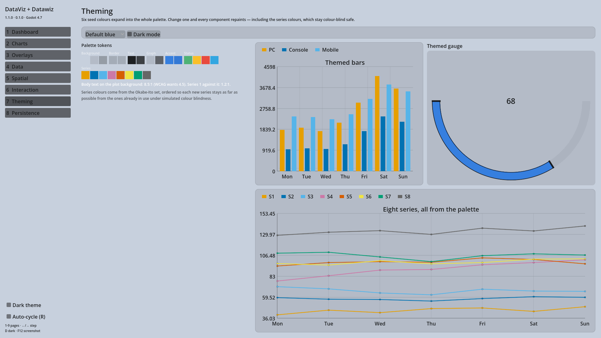
One resource, six seed colours, every component. Series colours come from a colour-blind-safe palette and the theme can tell you the contrast ratio it achieved.
Tutorials
Customize the default theme
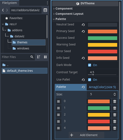
The theme manager uses a DVTheme Resource file found here. Each them has a Dark/light mode toggle for easy switching.
Set the active theme
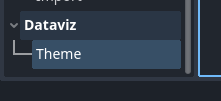
The active theme can be updated through the Project settings. (Check the bottom of the list and select your custom resource file.) Or via script.
Reading colours yourself
A game usually draws its own UI next to a chart, and it should not have to copy hex values out of the theme resource by hand. Since 1.1 the palette is readable at runtime.
var theme: DVTheme = DV_ThemeManager.active_theme

# get_token_color(domain, sub = 0, variant = 0)
var panel_bg := theme.get_token_color(DVColorScale.Background)
var body_text := theme.get_token_color(DVColorScale.Text)
var accent := theme.get_token_color(DVColorScale.Accent)

# The Series domain is the categorical palette charts draw from.
for i in 6:
	print(theme.get_token_color(DVColorScale.Series, i))
The domains are Background, Border, Text, Graph, Accent, Status and Series. Every colour is generated from your seeds against the theme's contrast target, so the same call gives you a readable result in light or dark mode without a branch.
Checking contrast
get_contrast_ratio() returns the WCAG ratio between two colours — 21 for black on white, 1 for a colour against itself. Useful in a test, or when you are picking a custom seed and want to know whether label text will survive on top of it.
if theme.get_contrast_ratio(label_color, panel_bg) < 4.5:
	push_warning("Label text will be hard to read on this panel")
Where a series colour comes from
Four things can decide the colour of a chart series. They are checked in this order, first match wins:
chart.set_series_color(index, color)— a per-series override.chart.palette— a palette set on that one chart.theme.palette, when the theme hasuse_paletteon.- The theme's generated
Seriestokens.
In 1.0 a theme change silently discarded anything you had set in code. It no longer does: an override survives a theme swap, and chart.reset_palette() is how you hand control back to the theme. chart.has_palette_override() tells you which state a chart is in.
The generated Series palette is ordered so that adjacent series stay distinguishable for the common forms of colour blindness, and every entry is checked for at least 3:1 contrast against the chart background.
Naming
use_pallet was a spelling mistake, and it is still there so 1.0 projects and saved .tres files keep loading. use_palette is the name to use in new code; both drive the same value, and neither will be removed before 2.0.