Other UI
A chart tells you that something happened. These three tell you what.
They are the controls you reach for after a player clicks a bar and wants the detail: the rows behind the number, the record behind the row, and where on the map it happened.
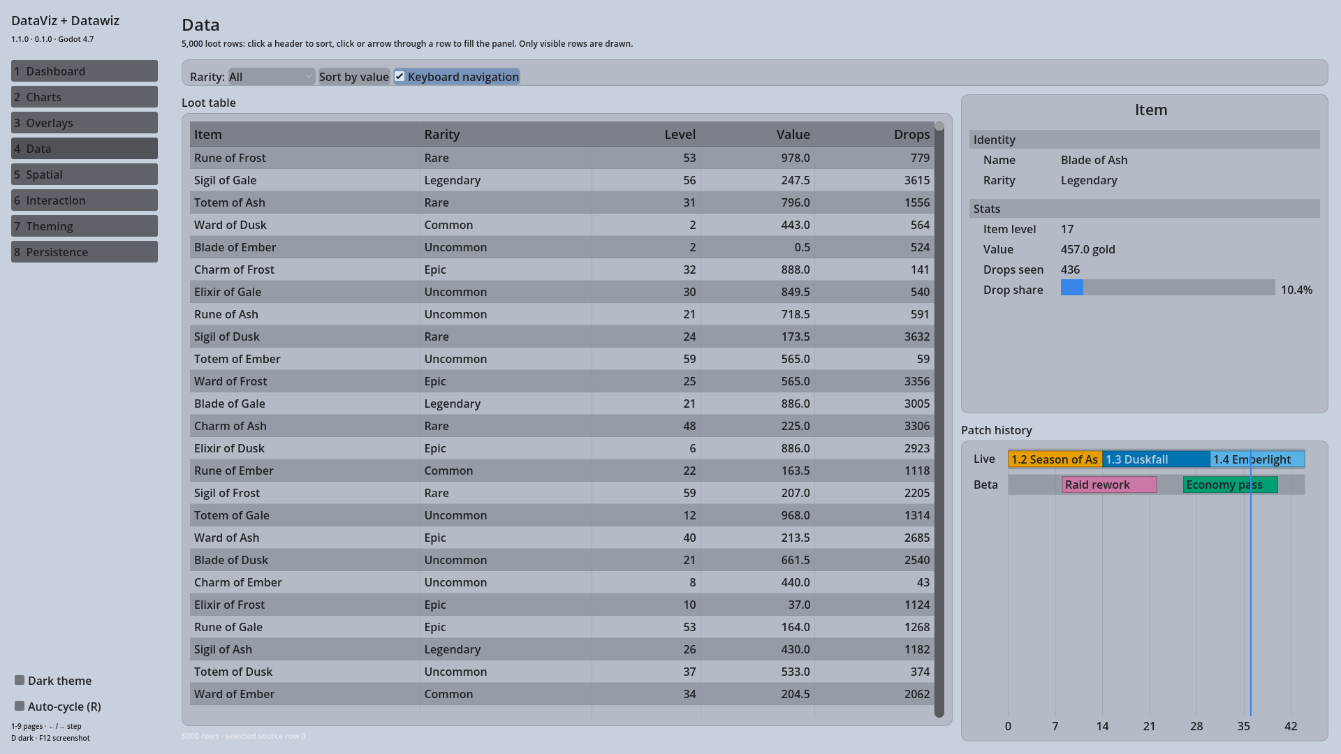
Table Grid
A virtualised grid. It draws only the rows on screen, so ten thousand rows cost the same as ten to display; sorting all 10,000 of them takes about 10 ms.
grid.set_columns(["Item", "SKU", "Qty"])
grid.set_data(rows)          # Array of Arrays, or Array of Dictionaries
grid.sortable = true
grid.cell_clicked.connect(_on_cell_clicked)
Columns share the width proportionally by default, it sorts on a header click, and arrow keys move the selection when the grid has focus.
Detail Panel
An inspector for one record. You add fields; it lays them out in groups, wraps
long values, scrolls when there are more than fit, and renders by type — a
number with a progress_percent becomes a bar, an Array becomes pills.
var f := DV_Field.new()
f.label = "Strength"
f.value = 24
f.progress_percent = 43.0    # renders as a bar
f.group = "Stats"
panel.add_field(f)
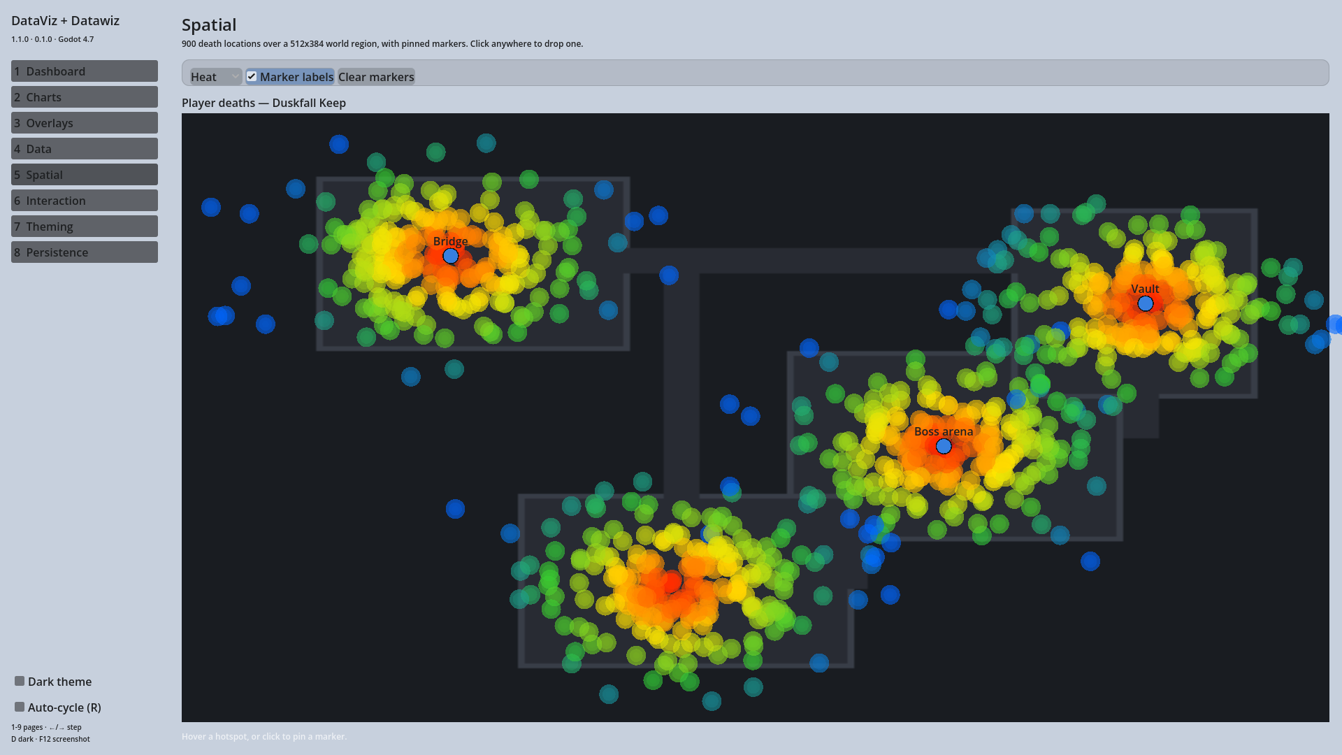
Heat Map
Density over a world region, with an optional background texture and pinned stickers. Built for showing where things happen on a map rather than when.
heat.set_background_texture(city_map)
heat.set_world_region(Vector2(-2000, -1000), Vector2(4000, 3000))
heat.add_point("Theft", "Market wallet", Vector2(300, 200), 0.8)
All three take their colours from the Central Theme Manager, emit the same hover and click signals as the charts, and are keyboard navigable.