What's new in 1.1
1.1 is a correctness and interaction release. Nothing was removed: every 1.0 call still compiles, and old theme resources still load.
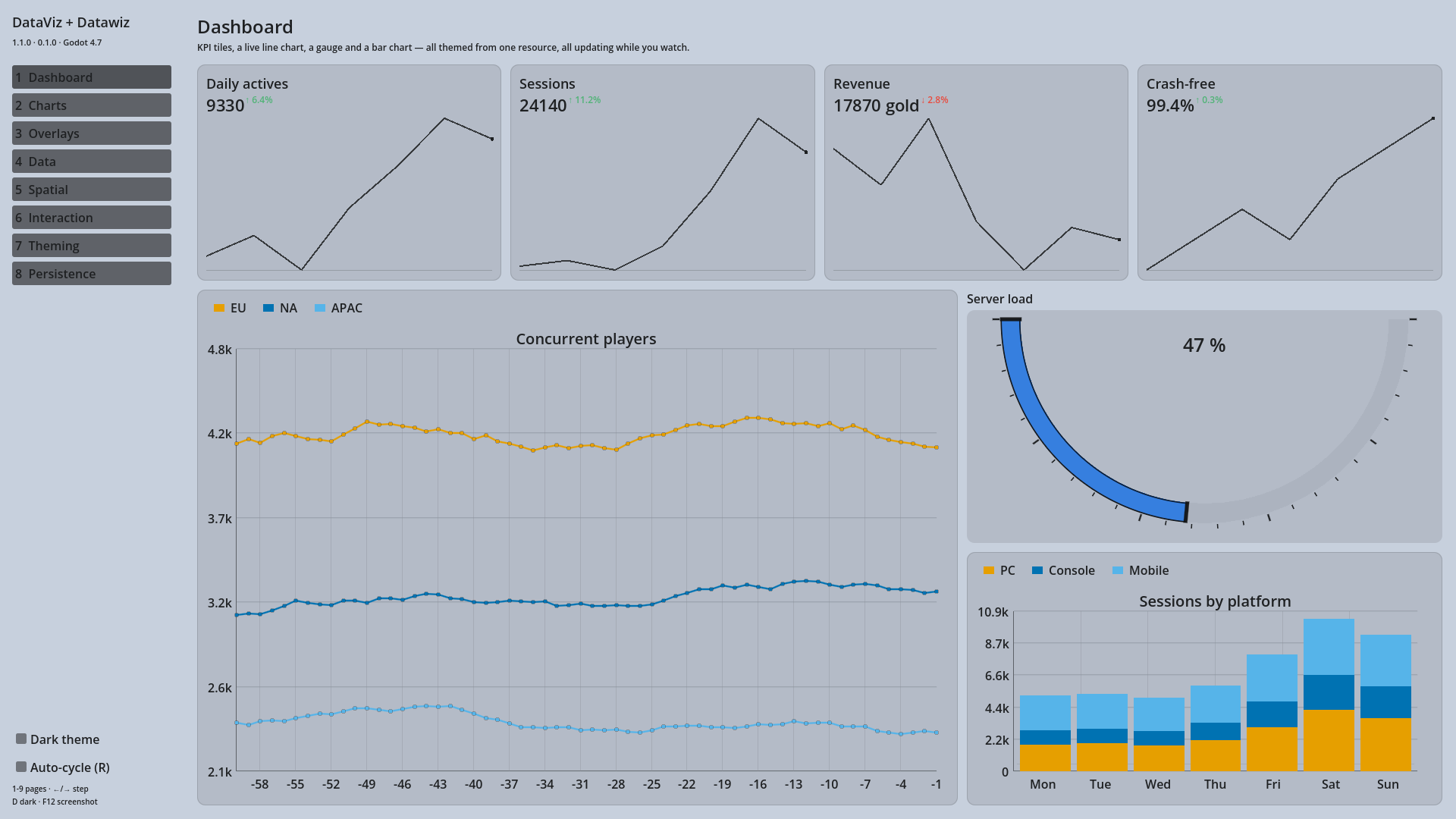
One set of signals for every chart
Each chart used to have its own signal names. They still fire, but every chart now also emits the same three, so one handler covers all of them:
chart.item_hovered.connect(func(series, index, value): show_readout(value))
chart.item_clicked.connect(func(series, index, value): drill_into(index))
chart.selection_changed.connect(func(series, index): sync_other_views(index))
chart.hover_exited.connect(hide_readout)
item_hovered fires only when the item under the pointer changes, so it is safe to
drive UI from directly.
Keyboard and gamepad
Charts and the grid take focus and respond to the standard ui_* actions — arrows,
Page Up/Down, Home/End, accept and cancel — so they work with a remapped scheme or a
controller, not just a keyboard. The focused widget draws a ring in the theme's
accent colour and the selected item is outlined.
move_selection() exposes the same moves to code, for driving a chart from your own
input handling.
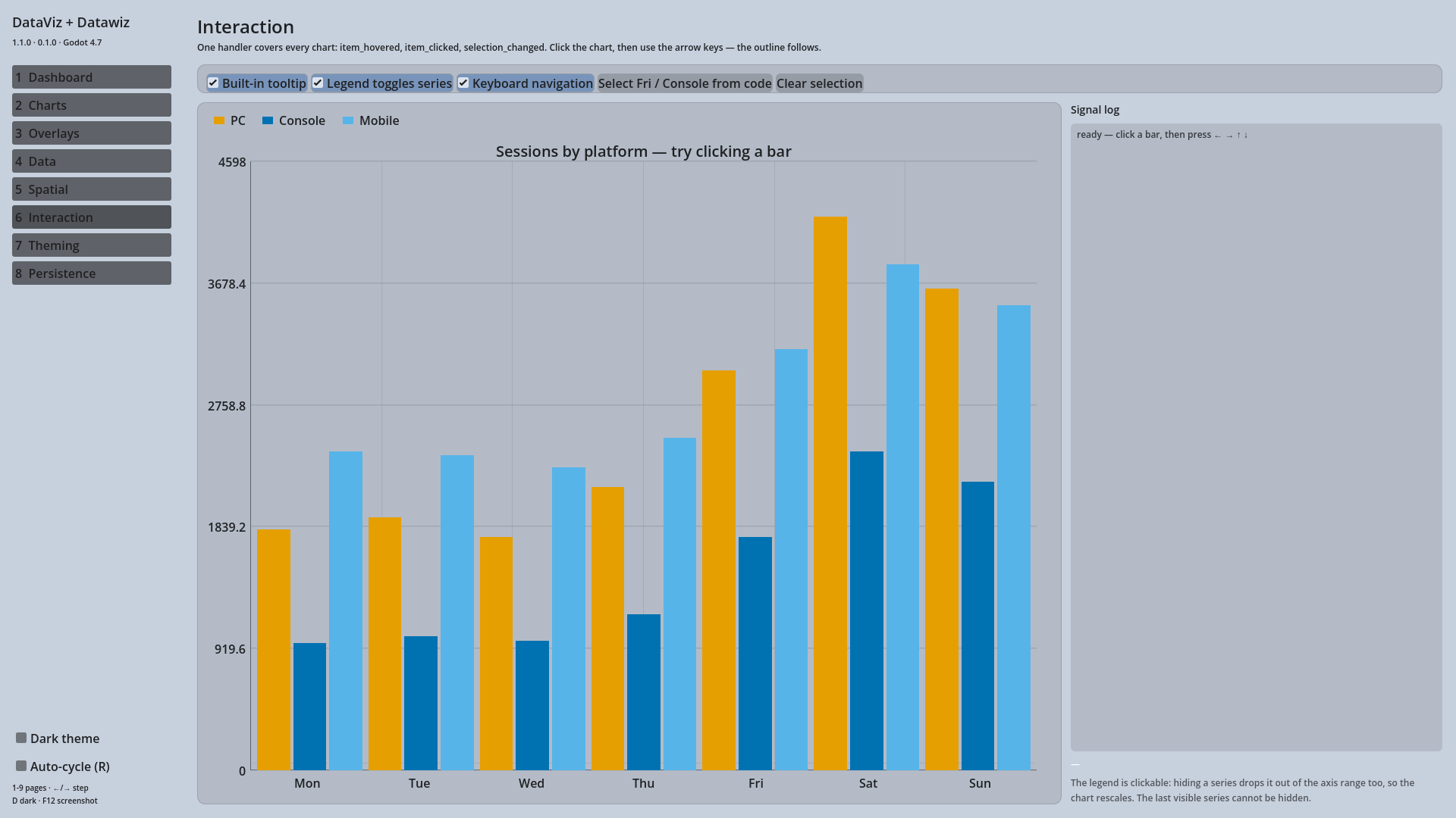
An interactive legend
Clicking a legend entry hides or shows that series, and the chart rescales — a hidden series is left out of the axis range as well as the drawing. Hidden entries are dimmed, outlined and struck through, so the state survives a greyscale screenshot. The legend can also sit left or right now, not just top or bottom.
A logarithmic axis
chart.y_scale = DVChart.SCALE_LOG
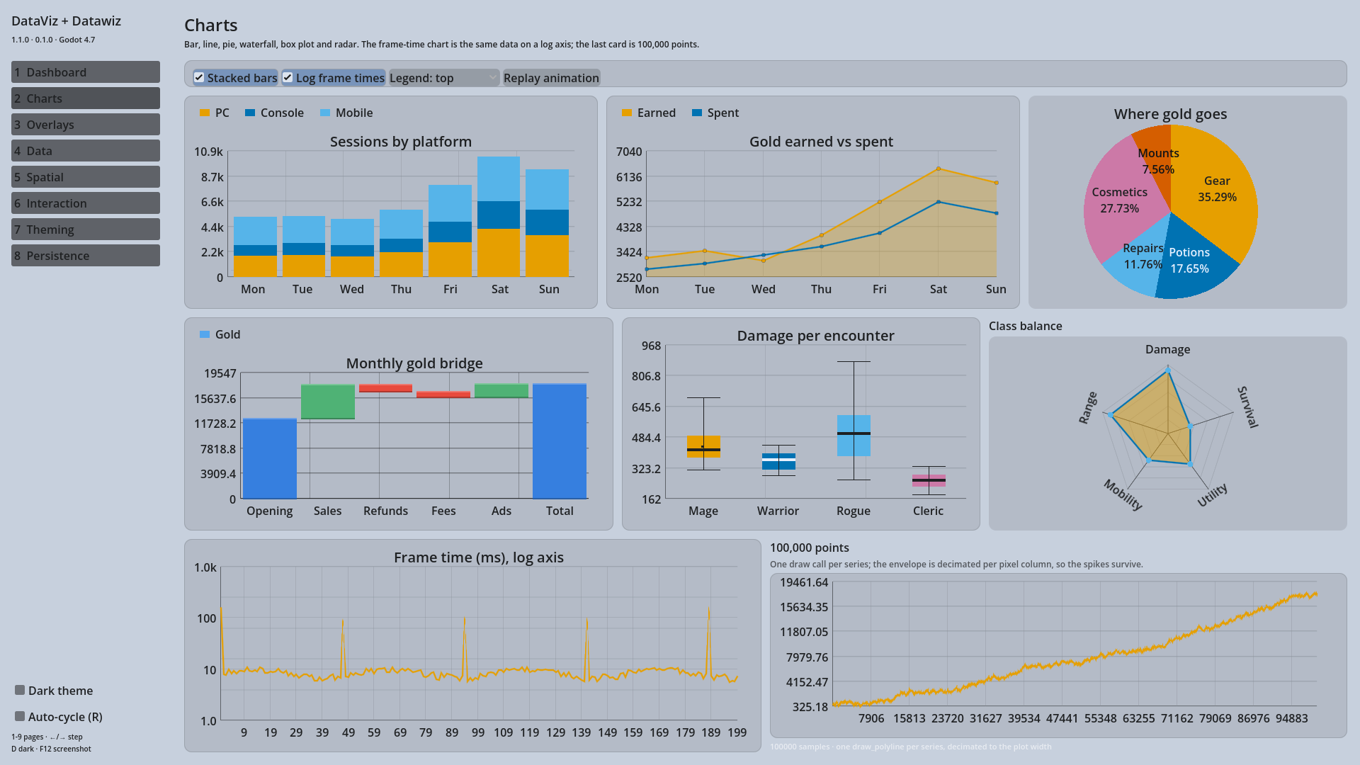
The range snaps outward to whole decades and the gridlines land on them, so several orders of magnitude fit in one chart and exponential data draws as a straight line.
Overlays
SMA, EMA and Bollinger Bands are per-series overlays the chart computes for you — see Overlays.
Speed
A 100,000-point line chart used to take 460 ms to redraw. It now draws in less time
than the test harness can measure, through four changes: the dirty flags actually
gate the range scans, each series draws with a single draw_polyline, dense series
are decimated per pixel column (keeping the spikes), and dense axes thin their labels
to what fits.
Two intentional visual changes
- Negative values are drawn. 1.0 had an inverted autoscale clamp that flattened any series with a negative minimum onto the axis. Charts with negative data now show a range below zero, with bars growing down from the zero line.
- New default series colours — the Okabe-Ito palette, ordered so each additional series stays as far as possible from the ones already in use under simulated colour blindness.
Bar charts also now include zero in their range, and stacked bars scale to the stack
total rather than the tallest single series. Grid columns share spare width instead
of giving all of it to the last column (stretch_mode = DV_Grid.STRETCH_LAST restores
the old behaviour).
It runs in a browser
Both toolkits compile to WebAssembly. The demo above is the same project exported to the web — charts, grid, heat map and all.